
Hype Branding
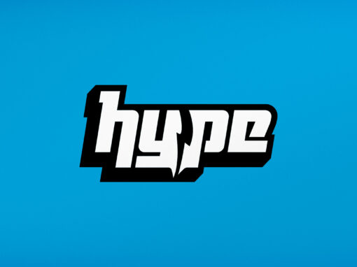
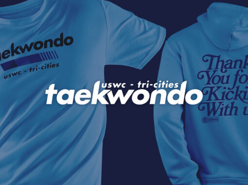
Hype Taekwondo sought a unique brand identity to articulate its departure from conventional martial arts schools. The goal was to visually communicate its modern, high-energy approach, strong community focus, and commitment to fostering positivity and confidence, thereby attracting families and individuals seeking a contemporary experience.
We engaged in strategic brand development, culminating in a dynamic and cohesive visual identity system. This system features bold, custom typography designed for impact and playfulness, anchored by a striking cyan blue color palette reflecting vibrancy and youthfulness. A key graphic element, the lightning bolt motif, was integrated to symbolize the energy, speed, and sense of achievement (“big wins”) central to the Hype Taekwondo experience.
We delivered comprehensive brand guidelines and provided creative direction to ensure faithful execution across all platforms. The identity was meticulously applied to essential brand elements, including app icons for digital engagement, impactful studio signage reinforcing the physical space’s energy, branded apparel fostering community, and targeted paid social media campaigns to drive awareness and enrollment. The result is a unified brand experience that clearly communicates Hype Taekwondo’s unique value proposition.


Agency
zth.design
Client
Hype
Sector
Professional Services
Discipline
Branding
Project Team
Zach Hallum
Branding, Design


Got a project?
Let's connect.